As I said in this blog, attending Professor Claudio’s class is fun. You throw a question at him and he’ll start solving with you and when he’s done teaching for the day, he’ll organize fun interactive visualization exercises by dividing us into teams. Like in week 2, he divided us in teams of 2 and instructed us to derive data questions from given domain questions based on some abstract data. But more on this later. This blog is more about documenting my journey in this class and reflecting on it at the end of the semester to see where I started and where I’ve come.
Looking forward to tonnes of coding and crazy crazzyyy visualizations!!
Week 1: 1st September, 2022
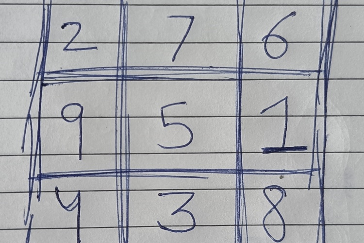
I’ve been of this opinion for a long time that infoviz = good crazy graphs. And lately, I’ve realized that, that’s not it. And in the first class here at NYU, the professor taught me that InfoViz is really: A computer-aided visual representation of data, to amplify cognition. So the purpose is to make it easy for the viewer to understand the information presented via visualization. In more layman’s terms, the audience should be able to understand the information with the least possible burden and effort, that the presenter wants to communicate. More layman? I want to show you that price of AMAZON stock has been increasing in general for the past 20 years -> I can either give you a table of all the dates and the corresponding price for every day in the past 20 years OR I can just plot them in the graph, scale suitably and the present that to you. What’s preferable for you? Why? The best example that I found to make this realization hit hardest, was the example that professor Claudio showed, “the GAME of 15”. The rules are very simple: Connect three consecutive cells (a row, column, or diagonal) such that they sum up to 15. Try it out, make some dummy attempts or play with someone.
 the Game of 15
What if I tell you, that all rows, columns, and diagonals always sum up to 15? And that essentially makes the game the same as your TIC-TAC-TOE. More formally this would make them: problem isomorphs (in super layman’s terms: different front-end, but same back-end). Now tell me this, which game do you think is more famous? What do people play more? Had you even heard of “the Game of 15”? Why is it so? The answer is TIC-TAC-TOE is easier for our brain to comprehend and the visual information does not overwhelm it. So given choice between the two, TIC-TAC-TOE wins!
Week 2: 8th September, 2022
I realized one major flaw in my approach so far on visualizations. My approach was always “technical aspect” first. Somehow the idea of adding the skill set of a particular library like Bokeh in Python or D3JS in JavaScript is so ingrained in me; that I often ignore the bigger picture. Someday, I might plot the best graph using the best available tool/language/framework in the market, but if it doesn’t solve the purpose then what was the use of it at all? And in this week’s lecture, I think Professor Claudio might have just changed that! As we figured out in the last lecture, Information Visualization is not only plotting graphs but amplifying cognition. And this is a much more formal process than I’d thought. The correct way to start with an infoviz problem is to think “What questions do I need to answer?” rather than with the thought that “What is the best way to visualize this data?” One must begin with a goal or a hypothesis one wants to prove. These questions initially take the form of “domain” questions which are quite vague and too broad. For example, given data for the number of crimes reported each day for the past 2 years for a particular area, the broader question at the beginning might be something like “Has the area gotten any safer with time?” There’s nothing wrong with this question, but this is something a computer can’t understand. We need to be specific and quantify everything; “convert” these domain questions to data questions. Something like, “Have the number of crimes reported daily decreased over the past 2 years?” Notice the difference?
The formal process to an infoviz problem has been amazingly proposed by Professor Tamara Munzner in his paper titled “A Nested Model for Visualization Design and Validation” here
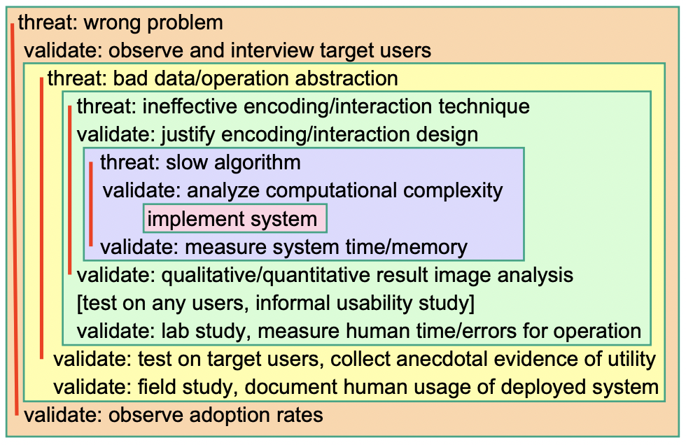 Professor Tamara Munzner’s model proposed in his paper, picture taken from the same here
कथं विद्यामहं योगिंस्त्वां सदा परिचिन्तयन् ।
केषु केषु च भावेषु चिन्त्योऽसि भगवन्मया ॥
– Bhagavad Gita 10.17॥
(Read about this Shloka from the Bhagavad Gita here at sanskritslokas.com)
 Week 1 @ NYU, Month 1 @ NY - another beginning!