Short NOTE:
- This was also our submission for the Final Project for Information Visualization taken by professor Dr. Claudio Silva at New York University.
- We have created all vizualizations using D3JS (Javascript based Visualization library), you can find all code here in Observable Notebook hosted online [here]
co-authored by Sonali Singh
Those of us belonging to the IT Industry, or initiated to the corporate world have all heard of the legendary 5 - FAANG.
- Apple
- Amazon
- Netflix
It’s not surprising, that our parents, many of whom haven’t got the first idea about Computer Science & Engineering, know of these companies all so well.
Although, it’s funny to us, that after Facebook became Meta, and Google turned to Alphabet, the monicker persists. What will it be really now though? MAANA? So it seems! Interestingly, there’s another acronym in the town - MAMAA (drop Netflix and add Microsoft). And with the growing popularity of Tesla and its claims that it’s a technology company, here’s another one: MAMATA.
Now we don’t have anything personally against FAANG or these legendary companies. Indeed, they have contributed enormously to humankind. Our problem lies here: The current generation of Computer engineers competing to get into FAANG like it’s the end of the world. The mindset that FAANG is all that there is post-graduation and that it’s not ‘worth’ to work for other companies is what we are after. Media and modern pop culture have glamorized FAANG enough.
With this, let us introduce you to the objective of this blog piece - is FAANG really a class apart? Or is this just the same old sample selection bias? Since the scope is broad, we’ll limit it to a purely fact-based Financials perspective using some commonly available financial metrics of FAANG and some of the other companies that we thought would be capable (sarcasm?) of being their competitors. Before we start:
DISCLAIMER:
- This project and blog piece in no way recommend or give any financial advice
- The contents of this project are not any form of financial fundamental analysis
- This is purely a naive attempt to compare FAANG with its possible competitors and find any patterns purely from the aid of visualizations. The keyword is naive since many companies are not even from the same domain.
So let’s get started, we just went through NASDAQ Index and found 15 companies that we thought out of conventional wisdom, would serve as good competitors to FAANG. We also through Costco Wholesale and Starbucks in the mix, for the sake of a variety of domains (outside Tech) and blatant humor. We’ve also added 5 companies that we believe are new age (they IPO’d in 2021), to just see how they fare against FAANG and the 15 competitors. This brings the total to 25 companies.
NOTE: All financial data based on Share Price is as of 1st December 2022, all other financial data has been extracted from the company’s respective latest annual statements.
Here is our sample set:
- Competitors: Nvidia, Microsoft, Paypal, Oracle, Broadcom, Tesla, Uber, Salesforce, Adobe, Cisco, Qualcomm, Intel, Starbucks, Intuit, Costco
- New Age Startups (all IPO’d in 2021): Bumble, Coursera, Robinhood, Gitlab, Coinbase
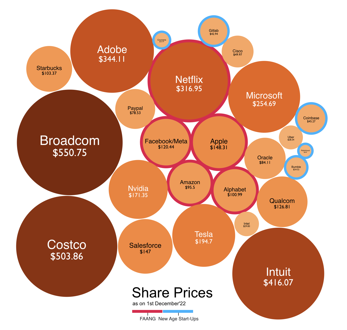
Let’s start by having a look at the share prices of these companies [as of 1st December 2022]
 Code for visualization here
Before we try and observe anything, let us tell you, even trying to observe anything in this visualization is plainly wrong. Or worse, it is a sin. Looking at the share price of a company in isolation, and comparing it with the share prices of other companies (irrespective of the domain) is the biggest mistake a person can make. Let’s see why? Take Broadcom, its share price is $550.75. What does that tell you? That on 1st December 2022, it was the best company as compared to these 24 others? Best in what sense? It was the most expensive company? Okay, but in what sense? Intuit is at $416.07. So does it mean that it was better than Adobe, Netflix, Microsoft, Google, Meta, and Apple? Share price does not answer any of these questions when looked at this way. Maybe you could take one company, see how its share price change over the course of a period, and maybe then, just maybe, try and figure out some things about that particular company. The share price does not even convey anything about the scale of the company. Let’s find metrics that do: Market Capitalization, Revenues, Assets, and maybe the number of employees.
 Code for visualization here
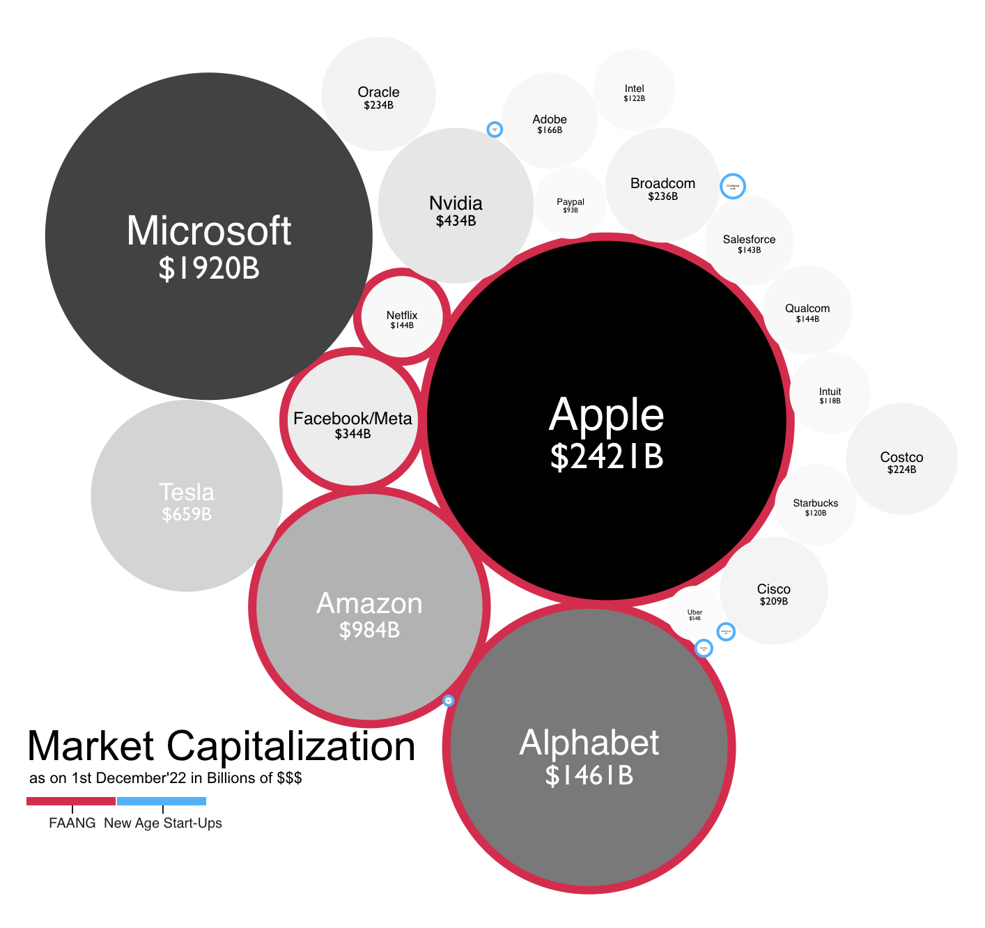
This tells a contrasting story as compared to the share price bubbles. What’s the market cap? Just multiply the number of outstanding shares for that company by the price of that share for the particular date and you will get the market capitalization for that company for that particular date. What does it tell you? Well, it’s just one of the many measures of the scale of a company. It tells you how much the market (which is comprised of you, your friends, all other retail investors, institutional investors, etc) think that the company is worth in the stock market. (this thinking is often not right, think of the recent tech bubble burst, more thinking? how ironic!)
Only the AAG seems to be standing out in FAANG. Surprisingly Tesla, Microsoft, and Nvidia have market caps higher than Meta and Netflix. The best kicker? Microsoft has the highest market cap, second only to Apple. We think MAMAA was the more apt monicker, haha! And Broadcom which had the highest share value has a market cap of $236B higher than Netflix, but much, much smaller than the other giants.
FAANG has not impressed us by standing out with its market cap.
Let’s look at their revenues and net profits.
 Code for visualization here
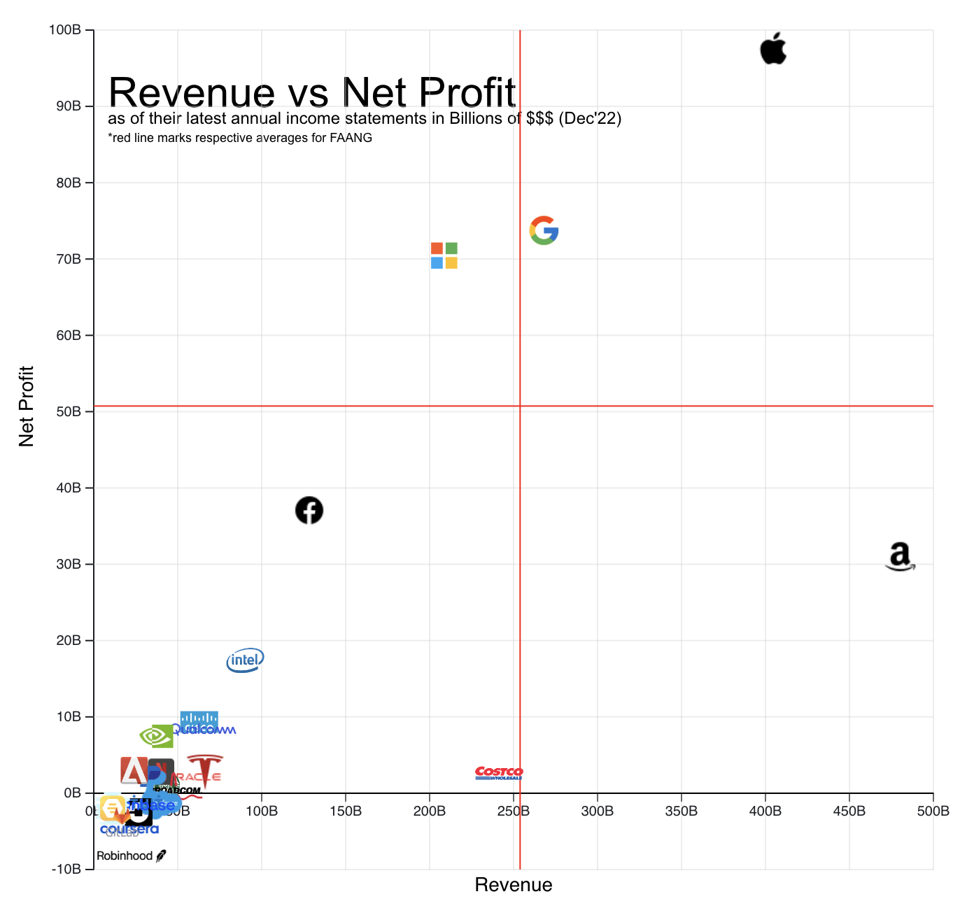
Well, revenue is the total sales a company achieves, also called the ‘top line’, and net income/profit is the amount you arrive at after paying all costs, wages, taxes, etc, also called the ‘bottom line’. Like the market cap, they also tell us about the scale of a company. Depending on the stage of a company (embryo/start-up, growth, mature, etc), these numbers have a shift in priority. A high-growth company (maybe like Robinhood) will want to focus on getting a good top-line right now because that would mean capturing a bigger piece of the stock-broking market, or more customers! However, a seasoned company like Nvidia would want to optimize its bottom-line, because they already are mature in its respective market, and have to focus on & optimize the profits they generate. As they say, in the end, it’s the real money - the profit that matters. All the revenue in the world will not matter if you can’t generate any profits in the foreseeable future. (coughs, “new age start-ups”, coughs more)
A company with higher revenue does not mean that it has a higher net profit. These items are at the extremums of the income statement of a company. And there is a big story that happens between these extremes. Numerous different line items like cost of goods sold, research & development costs, wages, administrative costs, depreciation, amortization costs, taxes, etc populate the statement. These line items bring in a lot of variability from the point of revenue to the net income. Each and every line item calls for optimization for different departments of the company. How a company does that, well that is exactly what business and business management are all about!
Amazon has the highest revenue by numbers, and by contrast Apple, Google, Microsoft, and (unbelievably) even Meta have higher net profits than Amazon. Costco Wholesale, which is not a technology company, does have higher revenue than Microsoft interestingly.
FAANG along with Microsoft continues to dominate this scale also. And Netflix remains a disappointment. Tesla and Nvidia have disappeared after a big show of their market caps.
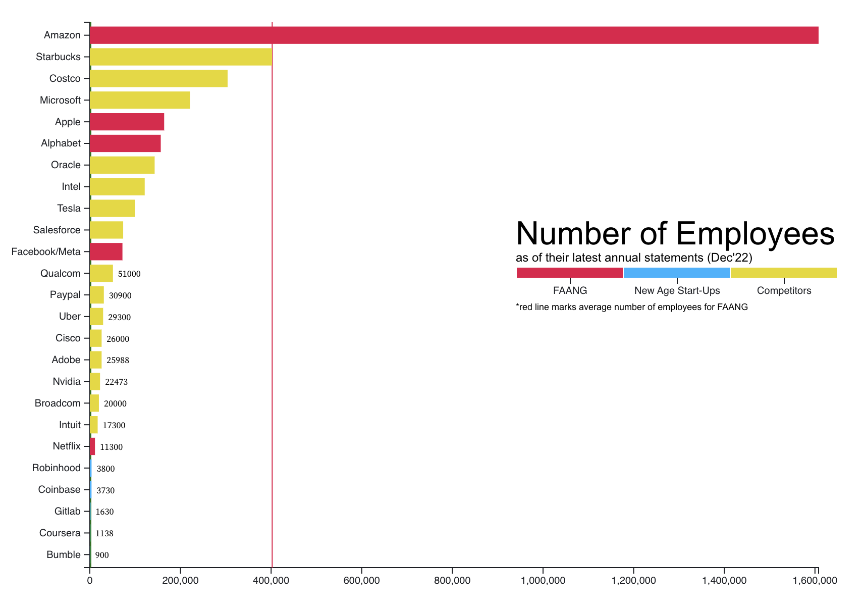
Let’s look at the number of employees these companies have.
 Code for visualization here
This is a straightforward metric. What does not come as a surprise is the top 3 companies by this metric are Amazon, Starbucks, and Costco. Any reasons for this? Guesses? Well, they are all operations heavy companies! And the average number of employees for FAANG is heavily skewed by Amazon alone.
2 interesting observations though:
- Netflix really has quite a small number of employees as compared to the other FAANG members
- All new-age companies have consistently the least number of employees and all rank last next to each other
The latter is rather basic since they’ve started operations recently and in these initial stages the number of employees is low, but with a high year-on-year rate of increase. It is quite saddening that even the well-established FAANG and other giants have been conducting mass layoffs recently.
NOTE: These numbers as per their latest annual reports (and don’t account for the recent mass layoffs)
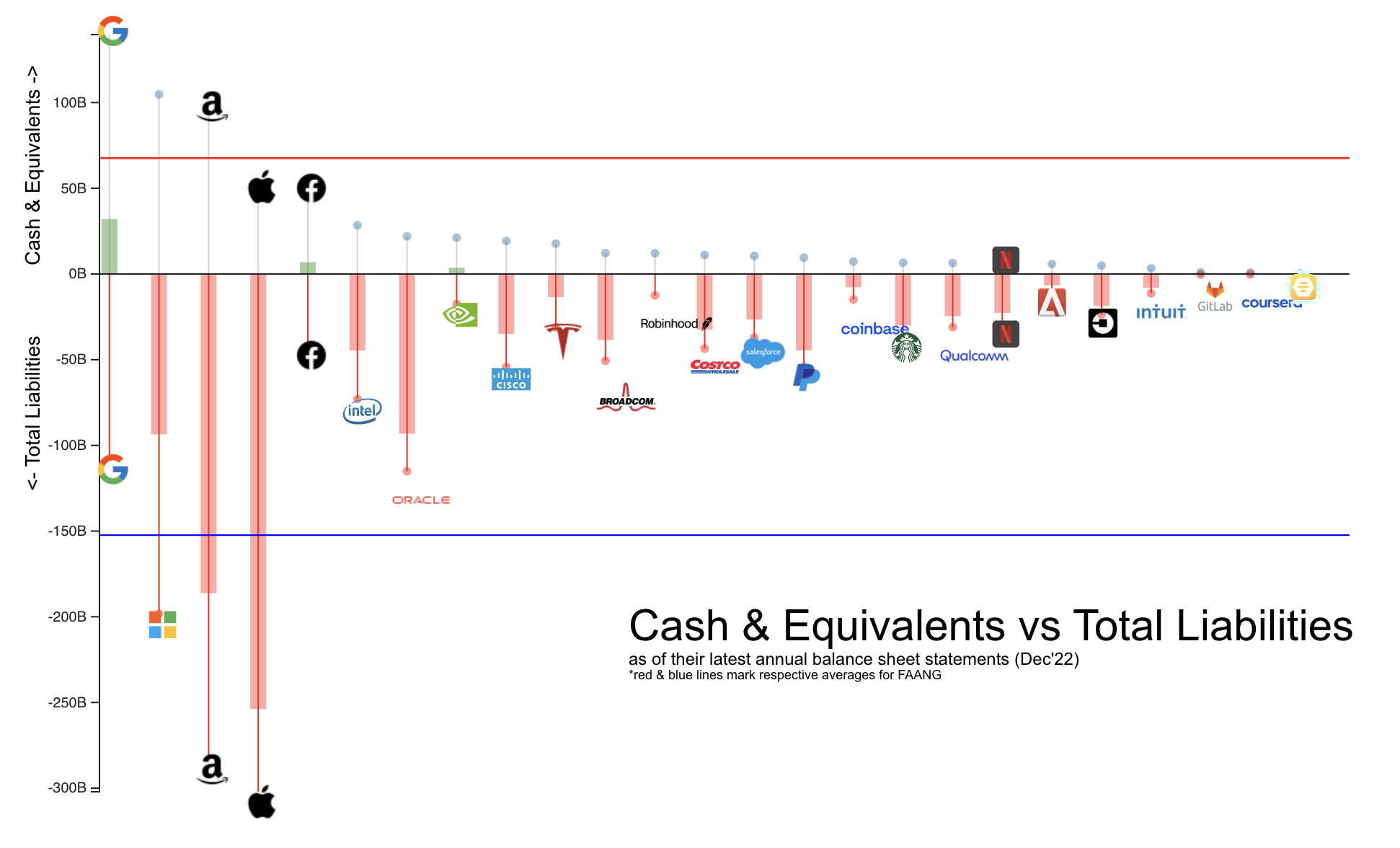
Let’s now look at the assets of these companies:
 Code for visualization here
In the balance statement of a company, there are many different kinds of assets and liabilities. For the sake of simplicity and appealing to the uninitiated, we have chosen Cash (real money $$$) and Total Liabilities (all kinds of liabilities, summed up by their $$$ value). Like all the metrics above these also represent the scale of a company.
Remember, in the Finance world, nothing is binary aka good or bad. The answer to any question is it depends. Why are we saying this? Because the layman feels that having a lot of cash is good, and having a lot of debt is bad. Well, since now we’re no more the uninitiated, the right answer is: “it depends”. In gross oversimplification think of it like this, having too much cash might mean that the management of the company does not how to utilize their cash. This might then reflect poorly on them. Similarly, having great debt might mean that the company is confident about paying back to their lenders, possibly because they have an excellent outlook for their near future. Well, nothing is for certain, and situations like this definitely ask for an in-depth analysis.
Keeping the above pointers in mind, FAANG plus Microsoft & minus Netflix continues to dominate this too, both in terms of cash and total liabilities. Intel & Oracle are surprise entries, coming behind Meta in terms of cash. Netflix has brought down the averages of FAANG members, it’s like the member of the group who does not contribute at all to the project :)
BUT but so far these metrics are unfairly biased to giants and FAANG in a sense because they give a true idea about their scale. Now one could argue that it gives these companies the advantage of being establishers of their respective market, having the early mover advantage, having truckloads of money simply because they have been operating for decades, etc. So now, we will look at normalized metrics. What does this mean? Well, some kind of metrics that mute this advantage of their enormously giant scale, which also include some commonly known financial ratios.
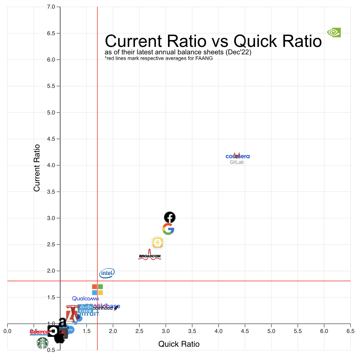
Let’s start with having a look at the current ratio and quick ratio of these companies:
 Code for visualization here
Before we try and study the visualization, what exactly are current and quick ratios? Well, they are found in line items in the Balance sheet of a company, and help in answering the question: “What position is the company currently in to meet all its short-term debt obligations, paying via its current assets?”
Again, looking at them in isolation does not tell much, however, comparing them with the industry surely does convey some information. Being above the industry average means that they indeed are in a good position and vice versa.
Both ratios have their current liabilities in the denominator. There is a subtle difference between the 2 ratios. The current ratio has current assets in the numerator, which are cash, marketable securities, inventory, accounts receivables, other current assets, etc. The Quick ratio on the other hand only has cash, marketable securities, and accounts receivables. Noticed yet? The Quick ratio, is stricter. It has removed comparatively illiquid assets from the numerator of the current ratio - like inventory, other current assets, etc. This also is the reason why it’s called the Acid Test Ratio.
By simple math, one can tell, that ratios being over 1 are definitely the desired condition to be in and that quick ratio will always be lesser than the current ratio.
A look at the visualization now. It is so interesting to observe that there exists a simple linear relationship between the current and quick ratio. NVIDIA is like an undisputed outlier. Another observation, FAANG seems to have lost its lead here in this visualization. Meta surprisingly has good numbers. Coursera, Bumble, and Gitlab seem to be having tonnes of beginner’s luck here, or is the business management for these companies really that great? Maybe these new-age startups have rationed more cash than needed for being prepared to tackle the uncertainties of the market. Netflix continues to be a disappointment, (a callback to Virat Kohli’s performance this year?) but this time it’s accompanied by Apple. It will be worth finding out why Apple has such ratios. We did see above, that it had the maximum total liabilities of all the companies. In general, FAANG has failed to impress us and stand out entirely with these metrics.
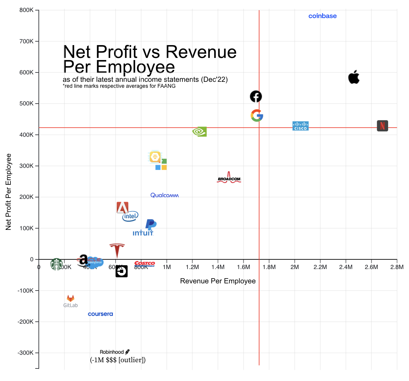
Let’s now look at the Revenue and Net Profit numbers again, but per employee:
 Code for visualization here
And, the prodigal son, Netflix returns. What a comeback! It has the maximum revenue/employee among all the companies. And a net profit/employee number at par with its FAANG brethren. Microsoft is the laggard this time (and that too in both metrics) bringing down the average. Coinbase and Cisco are the underdogs with Coinbase actually bearing the maximum net profit/employee amount by a huge margin. Gitlab and Coursera are loss-making companies, which is fine because that is expected of them being in the early stage. FAANG dominates this space, which again is fitting of them since they are expected to have optimized all of their costs and have achieved economies of scale.
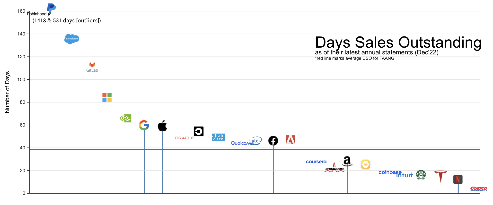
Let’s look at a lesser-known albeit super-interesting metric - Days Sales Outstanding:
 Code for visualization here
But first, what is Days Sales Outstanding? Keeping technicalities aside, this metric tells us that, on an average, how many days does a company take to collect the cash for the sale of the products or services they’ve made?
Again, looking at the numbers in isolation does not help much. Comparing it with the industry average does convey meaningful information. You definitely don’t want to be in a position, where you’re taking longer time to collect your payments than your competitors. The investors will simply ask this question: “Why are you taking longer than the rest?”
Looking at the visualization, Paypal and RobinHood are immediate outliers. Surprisingly Netflix has continued its magical streak and has not only the lowest DSO for all of FAANG, but is also the second lowest among all companies. New-age companies are all over the place. In general, FAANG has failed to stand out in this metric.
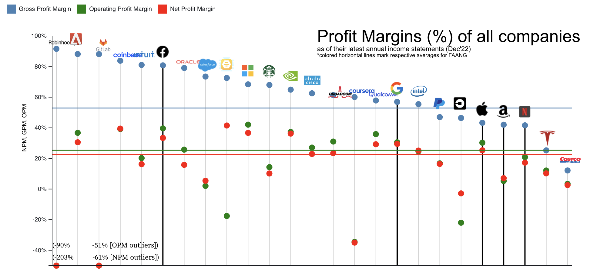
Let’s now look at some fundamental Income Statement ratios - Gross Profit Margin, Operating Profit Margin and Net Profit Margin:
 Code for visualization here
What are these margins? Well, the topmost line item in an Income Statement is the revenue. Then follows the cost of goods sold aka the cost of raw materials/goods that the company purchased to make those final products it sold. If we subtract this amount from the revenue, we get Gross profit. A company would ideally want to maximize this number. Price their goods as high as it is feasible for the market and business to get a higher revenue, and reduce the costs of purchasing those raw materials to achieve economies of scale. Dividing this number by the revenue gives us Gross Profit Margin.
Now, from the revenue, along with subtracting the cost of goods, also subtract Operating expenses like administrative costs, wages, research & development costs, amortization, depreciation, etc and the number we arrive at now would be the Operating profit. A company would ideally want to maximize this number also. They’ll want to optimize administrative costs, cut down on wages (a callback to recent mass lay-offs), etc. Dividing this number by the revenue gives us Operating Profit Margin.
From the above number, go on and now also subtract interest payments and taxes. This number we arrive at is the Net Income or Net Profit. Dividing this number by the revenue gives us the Net Profit Margin.
The definitions above are a gross oversimplification, and there is a lot of story and other variety of line items that inhabit the Income statement. One might assume that always GPM > OPM > NPM. However, there are certain extra-ordinary line items that contradict this thought. Amazon, Uber, Bumble, etc are a few such anomalies that we can observe in the visualization. Why it is so, is beyond the scope of this project.
Microsoft has a higher NPM than all of FAANG’s. Among, FAANG, Meta has the best margins. New-age companies Robinhood and Gitlab are nowhere to be seen, they are extreme outliers.
In the end, FAANG has yet again failed to stand out from the rest with these margins.
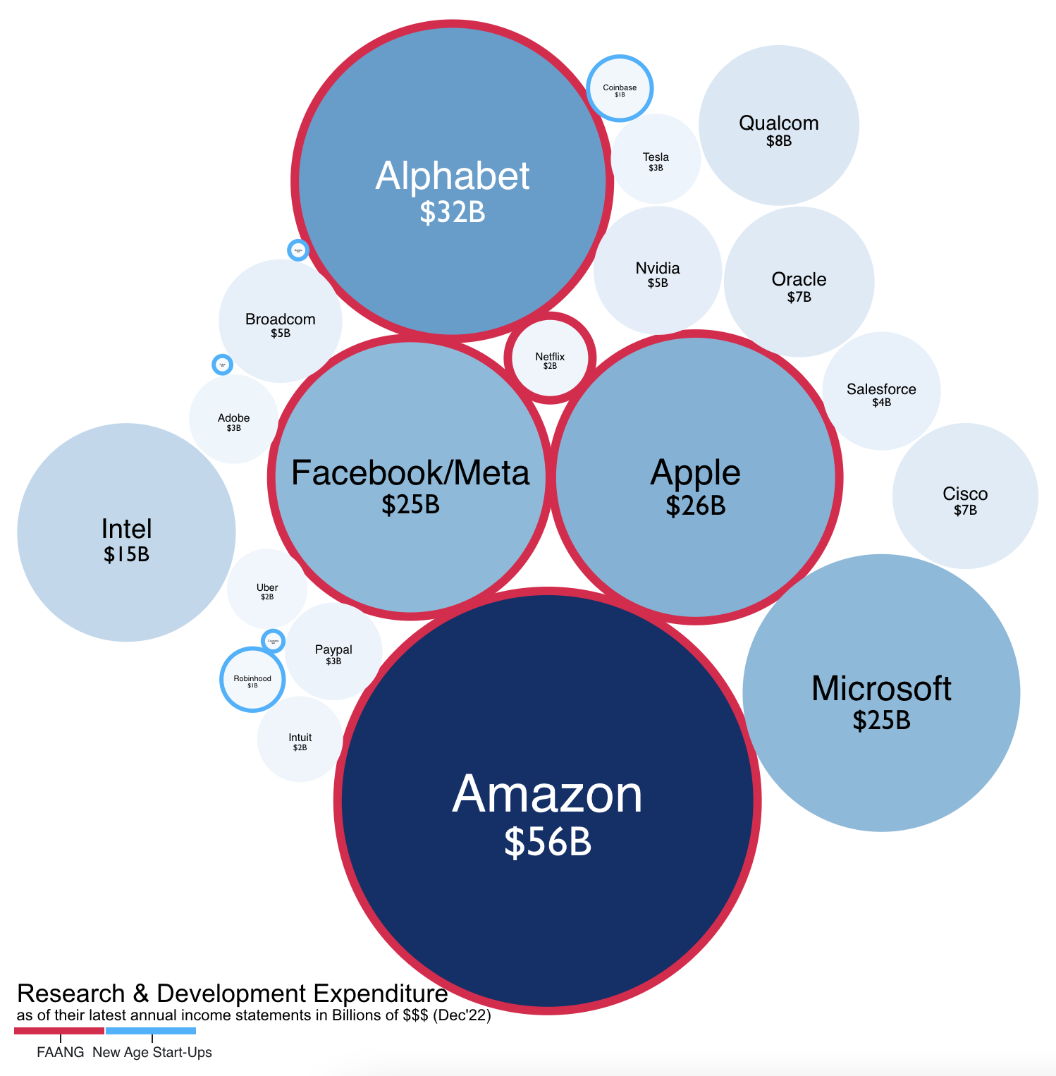
Let’s now look at our last metric for the project. The Research & Development Costs of these companies:
 Code for visualization here
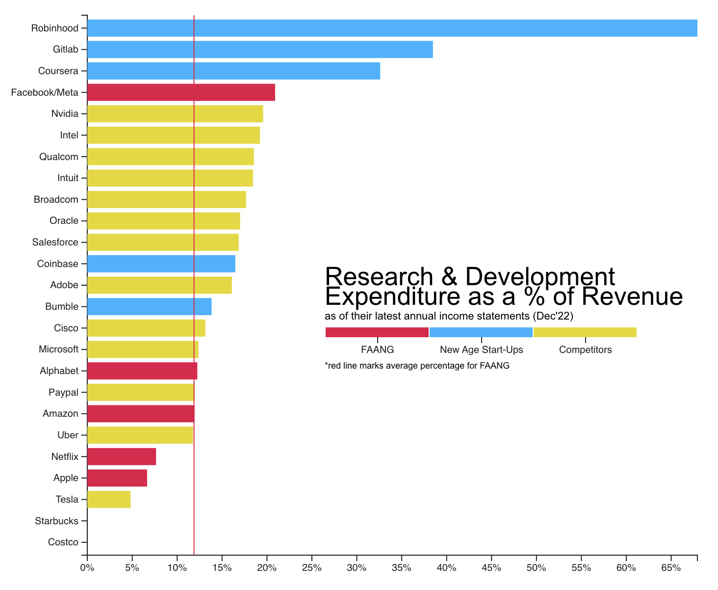
These are absolute numbers. And, FAANG minus Netflix plus Microsoft are clear winners. Though the least of FAANG minus Netflix squad, Microsoft still has a R&D Expenditure at par with Apple & Meta. Intel, Qualcomm and Oracle have made their presence felt with good R&D spends. FAANG has won this round again. One could argue that we are not looking at the percentage of revenue that the companies spent on their R&D. Well let’s look into that too:
 Code for visualization here
This does paint quite a different picture. FAANG has gone for a toss. Our underdogs, the new-age companies are leading the metric! Only Meta from FAANG has made it to the top 5, the rest are not even the in the picture! What is this happening? Why is this happening?
We see a high percentage of revenue being spent on R&D for the new age start-ups because that is normal for companies in this stage. They are bringing a new product to the market, they have to innovate a lot which commands a great budget, and hence a higher percentage of the revenue.
What does this mean for FAANG? Why is this percentage so low? Well, in this case, remember, this is just a percentage. The actual R&D spends of FAANG far outweigh the entire market caps of these companies (it’s almost laughable). Take Alphabet, for example, its percentage is around 12% (as compared to Robinhood’s ~67%), but the real amount of that R&D expenditure is ~ $32 Billion far greater than Robinhood’s ~ $1 Billion. One must remember, that FAANG makes up for their low percentages by having enormously high revenue. They get access to way higher real R&D Budget, which enables them to innovate more! So in this case, looking at the percentages really does not help us.
Conclusion
There are important and credible metrics where FAANG does not stand out and fails to outshine its competitors, like Profit Margins, Days Sales Outstanding, Current Ratio & Quick Ratio, and even scale metrics like market capitalization. However, this in no way is an exhaustive or correct approach to conclude this. On the other hand, it does tell that there surely are companies competing with FAANG, some even at par and we have some factual evidence, that no, FAANG is really not all that is out there.
References
We would like to extend our heartiest gratitude to our Information Visualization Professor at NYU, Dr. Claudio Silva, and the wonderful TAs Jun and Juan for guiding us throughout this project, and for helping kill the bugs which had once stained the canvas of these visualizations.
- All company’s logos and icons from: https://icons8.com/
- All financial data from: https://www.macrotrends.net/ and respective annual statements
वेदानां सामवेदोऽस्मि देवानामस्मि वासवः ।
इंद्रियाणां मनश्चास्मि भूतानामस्मि चेतना ॥
– Bhagavad Gita 10.22॥
(Read about this Shloka from the Bhagavad Gita here at sanskritslokas.com)
 My SEM 1: Information Visualization Class at NYU - a journal